Saturn / Capricorn / H11
Structure and public field. The dark tone becomes trust, not drama.

Case Study · 02 · Brand Identity Derivation
A brand identity built from mission, signal reading, colour logic, mark, type roles, and the first website surface.
Project Charge · First Derivation
JANORDO did not begin with an old visual system that needed correction. It began with a clear task: build a serious, warm, structured identity for crafted digital presence. The work was to translate mission and signal into colour, weight, mark logic, typographic roles, and the first usable web surface.
JANORDO starts with the method: clarify the mission, read the signal, derive the palette, define mark and type roles, then test the system on a real digital surface.
The task was to shape JANORDO as a studio for crafted digital presence. That already sets the tension: structure without coldness, design without decoration, digital modernity without performance for its own sake.
So the case is not framed as a service page or a redesign. It shows the method: what the brand has to communicate, how the signal narrows the choices, and how those choices become visible in colour, mark, type, and website direction.
Mission sets the task. The signal sets constraints. The identity becomes useful where both meet.
Crafted digital presence for local businesses and independent providers: serious, reachable, structured, and warm.
Janus marks the threshold. Ordo marks structure. Together they point to a clearer digital presence.
The reading translates into usable constraints: structure, warmth, value, order, and controlled modernity.
Colour, mark, type, and surface logic are developed together, then checked against the first website surface.
The palette is not a moodboard. It comes from the mission pressure: structure, designed quality, warmth, value, web order, and controlled modernity.
Saturn in Capricorn gives the identity its foundation: craft, durability, order, and no unearned effect. H11 adds the public field. This is why the dark anchor is not theatrical black. It is structural trust.
Venus in Capricorn makes designed quality earned, held, and useful. Form is allowed to be visible, but it must stay disciplined. That is the difference between identity and decoration.
Taurus in the second house brings matter, resources, value, and the human handshake. Terracotta gives warmth. Bronze gives worth. Both stay grounded so the identity feels reachable.
Mercury in Aquarius gives grid, language, navigation, and system logic. The hidden twelfth-house layer keeps the technical apparatus behind the surface. Uranus adds modernity; Saturn controls it. This is why the teal accent is clear and sparse.
The colour test — can the palette explain the mission?
Structure, warmth,
value, web order.
Derived from the mission.
Derivation Plate · Mission Signal
Structure and public field. The dark tone becomes trust, not drama.
Designed quality without decoration. The identity must feel built.
Warmth, value, matter. The identity stays human and grounded.
Grid, navigation, and language. Digital logic becomes invisible order.
Mission sets the task. Signal narrows the material. The identity is tested in use.
The JANORDO palette works because each value has a source and a task. Built, warm, modern, reachable: not a remix of the website, but the material logic beneath the brand.
Derived Colour System
Typography — proof plate only
The wordmark is an SVG asset. It is not rebuilt with live type, and the case does not imitate it in Hermetica headlines.
Geometric enough for structure, modern enough for web, controlled enough not to compete with the wordmark.
Plain, warm, readable. It keeps the identity approachable instead of precious.
Used for small labels and system signals. Technical, but quiet enough to stay beneath the brand.
Material Scan · The Threshold
Visual Grammar
Saturn gives fixed form: two quiet structural fields. The mark is built before it is expressive.
The threshold is larger than the structure it opens. Teal, bronze, and terracotta meet in one narrow event.
Frames, layout tiles, and grids become secondary motifs. They carry the digital logic without becoming a new logo.
Janus is not illustrated. The crossing is experienced through whitespace, structure, alignment, and the click moment.
Janus and Ordo do not make the brand mystical. They clarify the customer's movement: from an unclear digital threshold into visible order.
The manuscript draws the hard boundary: the name confirms the reading, but it does not generate colour. The threshold appears in the mark as an abstract opening, not as a symbol pasted onto the page.
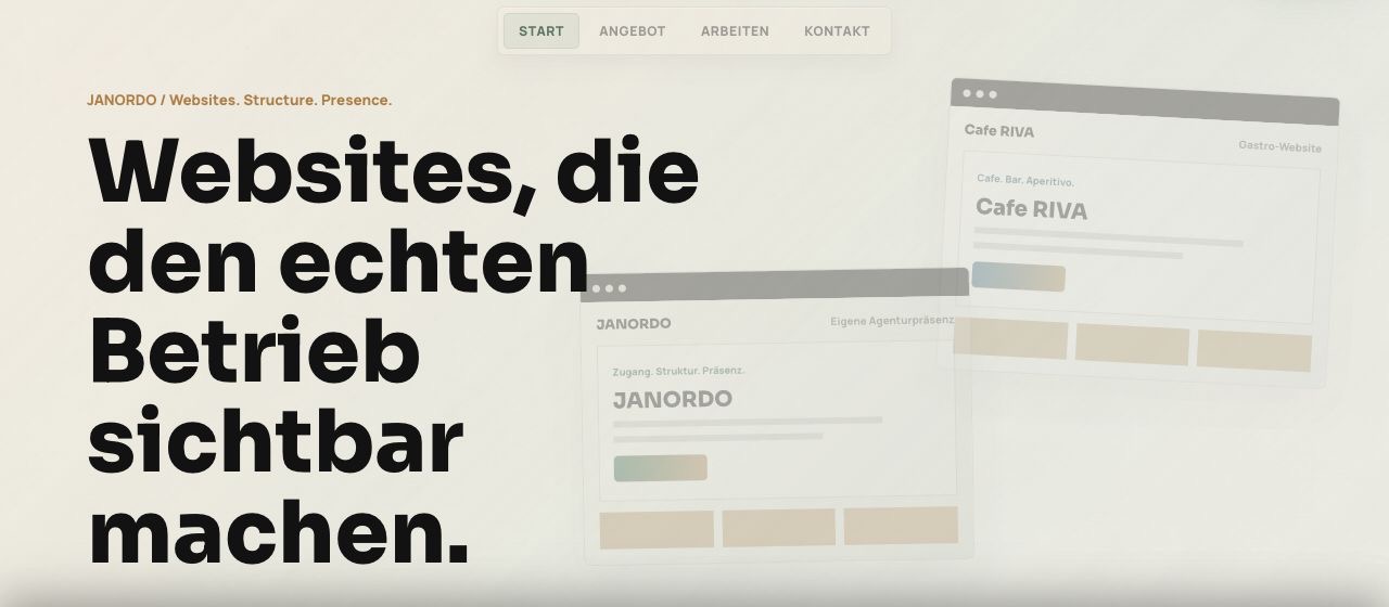
The application proof is not the subject of the case. It is the place where the identity first touches a real medium: mark, palette, hierarchy, grid, and brand temperature working together.
JANORDO holds the crossing and the order in one word. The brand is not decorated with a concept afterward; the concept is already in the name.
Janus · OrdoDark structure, warm ground, terracotta, bronze, and teal are not page decoration. They are the mission's temperature made visible.
Structure · warmth · signalTwo planes and a light slit turn the crossing into form. The threshold is not illustrated. It is built into the identity's most compact sign.
The Threshold
Brand Outcome
JANORDO leaves the construction phase as a traceable brand identity: name, threshold mark, palette, type roles, and first application surfaces all derived from the same mission signal.
We work with a small number of projects at a time.
If the pattern is ready, we will find it.